JOSS & MAIN VISUAL REFRESH
Brief
Joss & Main needed an updated visual brand system that could be more easily repeatable across all channels. This system also needed to reflect the brand voice: bold and editorial with a twist.
Brand Visual One Sheet:

Color
The core colors in the updated Joss & Main palette are based in neutral/earth tones so as not to overwhelm the brand imagery. Then as accents, bold colors can be used to convey the brands fun side. In addition to the core palette a seasonal pairing of a core and accent color can be used to support the seasonal storytelling in graphics.
Typography
Freight was selected to tie the brand to a more editorial look. It is reminiscent of fashion magazines and can easily be scaled up for a more eye catching typography treatment when needed. Nunito is a great pair with Freight because it works for body text and smaller typography treatments where legibility might be a concern. It is clean and brings a modern and cool element to the brand.
Shape & Pattern
The shapes are graphic elements Joss & Main was already using. By expanding into additional shapes designers have more flexibility when creating content. The shapes are used consistently as cutouts for imagery, retail store signage and graphic treatments. The pattern is a combination of all the shapes and is used in branded moments.
Badge Library
As Joss & Main is a retail brand it needed a core element that felt value forward. The system of badges to be applied in specific use cases helps to tell a customer where they can find sales, high quality products, free shipping, new arrivals and more. Each of these badges also has an assigned motion treatment for digital use.
Business Cards:

Retail Shopping Bags:

Billboard:

Branded Candles

Sample Seasonal Homepage:

Sample Seasonal Promotion Banners (Motion Not Shown):


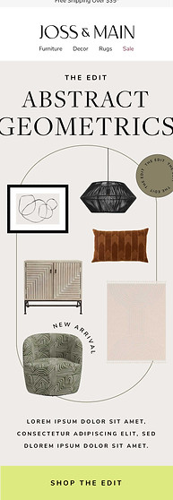
Sample Seasonal Email Content:


